Analyzing Trends in Widget Data

- Note:
- This function is only available for area charts, bar charts, column charts, line charts, and polar charts.
- Only time series with a single date dimension are supported. If the widget contains multiple data fields in the Categories section, this function is not available.
- This function is not available if a sorting option is applied to the value fields included in the widget.
- Using a Break by field is not supported.
- Null values might disrupt the calculations of the models and affect accuracy.
- Click
 , the Dashboards tab, and select a dashboard from the list.
 - On the dashboard, go to the widget that you want to work with.
- Click
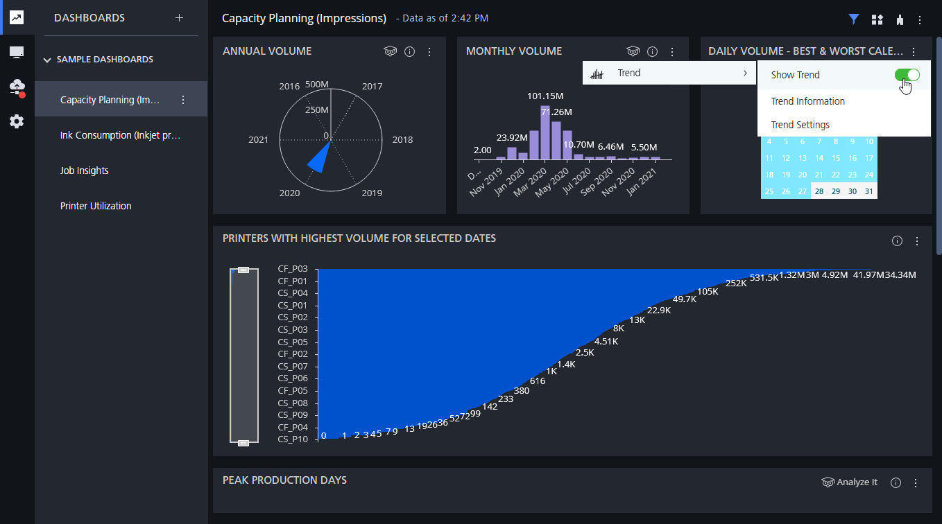
 , the Analyze It button, select Trend, and enable the Show Trend option.
If the widget includes multiple value fields, you must select the field that you want to analyze before enabling the Show Trend option.
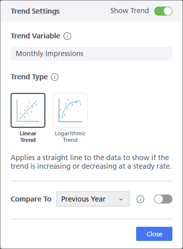
- To customize the trend line settings, select Trend Settings.

- Under Trend Variable, you can see the value field that is analyzed for the trend line.
- Under Trend Type, you can specify the type of trend line:
- Linear Trend
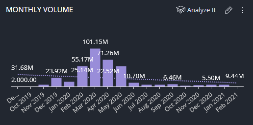
- Adds a straight line that shows if the trend is increasing or decreasing. A linear trend line is useful when the values are increasing or decreasing at a steady rate.
- Logarithmic Trend
- Adds a best-fit curved line that shows whether the data converges within time. A logarithmic trend line is useful when the rate of change in the data increases or decreases quickly and then levels out.
- In the Compare To section, you can add a second trend line that lets you compare the current trend
to data from a previous time period.
Select a time period from the list and enable the Compare To option. Equivalent data must be available for the selected time period.
For example, you can compare the trend for the daily number of jobs from this month with the trend from the previous month.
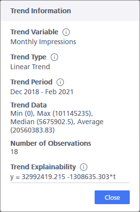
- To view information about the trend data, select Trend Information.

Once the trend line is added to the widget, you can click it at any time to open the Quick Settings dialog box and make any required changes.
You can also add trend lines from the Widget Designer. In the data panel on the left,
hover over the value field that you want to analyze and click ![]() , the Analyze It button.
, the Analyze It button.